We have been working with Severn Trent Water on the Dynamo project for almost two years, with a fleet of almost 6000 permanent pressure loggers installed on the network across 5 counties. It has become increasingly important for us to be able to report on fleet health, track maintenance activities and workflows, and drive improved performance. During the deployment phase it was acceptable to track activities through Excel proformas and basic graphics, however now that we are in a more established phase of the project, we have chosen to use Power BI for reporting due to its improved visualisation tools.
One of the key aspects we are keen to utilise is demonstrating fleet health through mapping tools. Using spatial data, we can identify signal trends across various scales, from Company level to individual streets. Furthermore, adding our data to an easily accessible map is extremely useful when engaging with our clients, as being able to view the loggers spatially gives a greater understanding of the issues we face and the techniques we are using to help improve performance. In order to create the correct visualisation for our project we trialled several mapping tools within Power BI to judge which would be most suitable.
Comparing Power BI maps
The most recent version of Power BI is fitted with several mapping tools as standard. These range from basic choropleth maps, that are useful for plotting demographics within a given space, to full ArcGIS plugins, that can bring entire workspaces into the visualisation. Each mapping tool has its own uses and advantages, but the data types that you can display within these maps are limited.
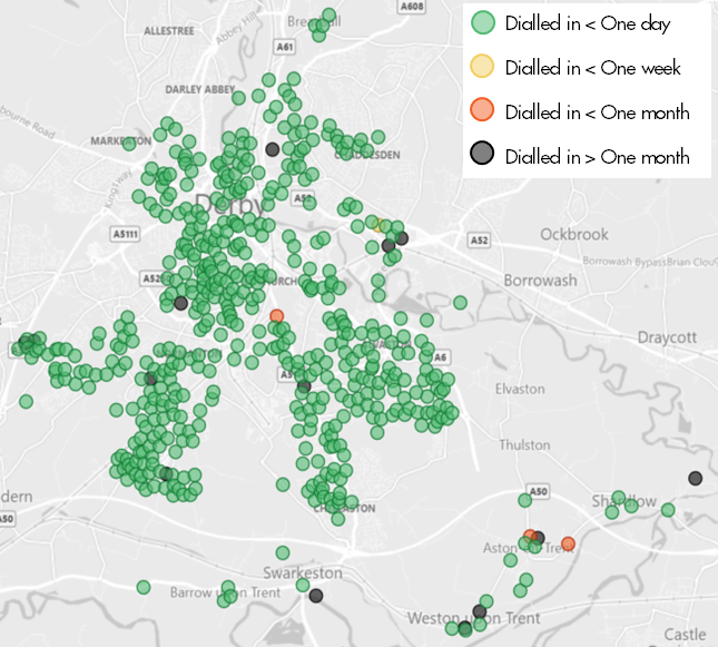
We’re currently using Power BI to report rolling fleet health on a weekly basis, which requires linking visualisations to our Company server. We store data on the daily number of dial-ins for every logger in the fleet, which allows us to track where loggers are quiet or require maintenance activities to improve their performance. Originally, we chose to use the basic map visualisation in Power BI to display loggers spatially. For the purpose of this blog post, we have used the Dynamo loggers in Derbyshire to show fleet health (see Figure 1).
Figure 1: Dynamo fleet health in Derbyshire using Power BI mapping
This gave us the ability to pick up correlations between quiet or disconnected loggers that may be in a signal black spot or affected by third party interference. This visualisation was useful for gaining a quick snapshot of where we had issues with individual loggers, but the basic options on the mapping tool meant that we could only display the loggers as simple coloured dots. Ideally, we required a way of showing the loggers relative to other DMA attributes and other assets within the DMA.
The obvious choice would have been to use the ArcGIS tool. However, this is a licensed based application that we weren’t currently using and therefore wasn’t readily available. We were also concerned that the size of a full GIS workspace would slow down the Power BI report, which would be constricting when trying to quickly display data for clients. Using a choropleth map would also have been extremely limiting, as it would reduce our visibility of individual loggers and give an overall density of loggers in need of maintenance per DMA. This could be useful as an overview or as a base layer, although since the Filled Map in Power BI is limited to one layer this was of little use.
The mapping tool we eventually decided to use was Icon Map. Icon Map is a plugin, created by James Dales, that is available in the custom visuals marketplace (AppSource) within Power BI. This mapping tool gives a wider range of options for visualising data in comparison to those that come as standard in Power BI. It allows the user to add multiple layers and icons to a single map and provides the freedom to customise the visualisation through colour and shapes.
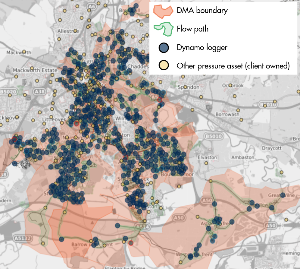
Figure 2 illustrates how we have implemented Icon Map in order to track where the Dynamo loggers have had maintenance jobs raised, and to which work flow each job belongs to. In this map we have also been able to include the DMA boundaries and our own flow paths that show pressure relationships between loggers on the network. These polygons have been added as Well-Known Text (WKT) strings, which were converted in SQL from geographical data stored on the server. We have also added the pipe data, to better understand how the loggers are installed on the network, and other pressure assets that are owned by our client which we can utilise for our analysis.
Figure 2: Overview of Dynamo fleet in Derbyshire illustrated in Icon Map
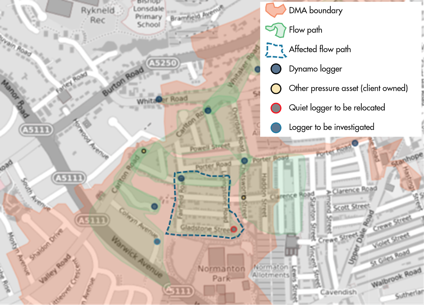
Icon Map also allows the use of GeoJSON files which can be added to the map via a URL. Seeing as most of our data has come from clients, we are unable to store this on an external server, which is why we have not been able to use GeoJSON in this instance. As a workaround, we have separated each data type using DAX measures within Power BI, giving the same visualisation, but unfortunately limiting us to a single flat layer. We are still able to view individual DMAs on the map by utilising the Slicer tool. Figure 3 demonstrates how the output of this tool works similarly to drilling down through layers, as here we can see in greater detail the loggers and flow paths within a chosen DMA.
Figure 3: Detailed view of a Dynamo DMA
The logger shown in the bottom right corner of the affected flow path has been flagged as being persistently quiet over the past three months and has therefore been added to the relocation workflow and a job raised, this is indicated by the red outline. The southernmost logger in Figure 3 has a blue outline, which indicates that this logger is returning anomalous data and needs to be investigated. By using colour coding on the map, we can see that in this DMA there are currently two flow paths that potentially wouldn’t return correct data when running the analysis. If there was a correlation between any quiet sites, we would also be able to see this and enquire about third party activity that has occurred in the area. These loggers will be tracked and once corrected will return to the standard Dynamo logger colour.
Icon Map currently seems the best fit for us. However, there is the possibility that some clients’ data security policies may restrict the use of a plugin. If this were the case, it would limit the types of visualisations we could share.
Conclusion
Although there are multiple options for mapping in Power BI, there seems to be a lack of tools that will allow the visualisation of varying data types. Power BI can display single blocks of data quite well, be it through coordinate points or showing the density of a metric within a geographical area, however for the purposes of the Dynamo project there is no apparent solution for effectively reporting fleet health in a clear way. Icon Map is currently the closest fit for our requirements, but there are still big questions around the viability of using a plugin that is not universally approved and is somewhat dependent on using online servers to host large data sets. We will continue to investigate different visualisation techniques, and hopefully a future release of Power BI will include a mapping tool with improved functionality as standard.