By way of a disclaimer, I would first like to say that I was wholly new to Power BI six months ago and even though I like to think I have come on leaps and bounds since then, the more established users among you may find my colleague Sam’s recent article on map visualisations more pioneering in its scope. In all honesty, I believe Sam started using Power BI six months ago too, but he really is insufferably good at picking things up!
With that said, Power BI has come to be our tool of choice for presenting data visualisations. Despite being in some ways geared towards financial applications, the relative ease of use of the platform and wide array of custom visualisations on offer gives it the necessary versatility to be ideal for our purposes. Also, the Power BI license was free through our existing Microsoft 365 subscription. So, there’s that too.
We found early on that Power BI can easily import data from a wide range of data sources, from individual data files through to SQL databases and beyond, allowing us to pull data together quickly and reproduce it in a user-friendly format. A key aspect of making the most from the platform has been gaining a working knowledge of Data Analysis Expressions (DAX), as we sought how best to present flow and pressure time series data.
Learning Microsoft’s DAX language, which can be used to drive data analysis in Power BI, is much the same as starting to learn how to use formulas in Excel. You might be able to use Excel to a limited extent by copying and pasting data, but the judicious use of formulas multiplies the number of ways you can manipulate data to draw out insights. Similarly, DAX is not necessary for basic users of Power BI, but understanding its complexities increases the utility of the tool manyfold.
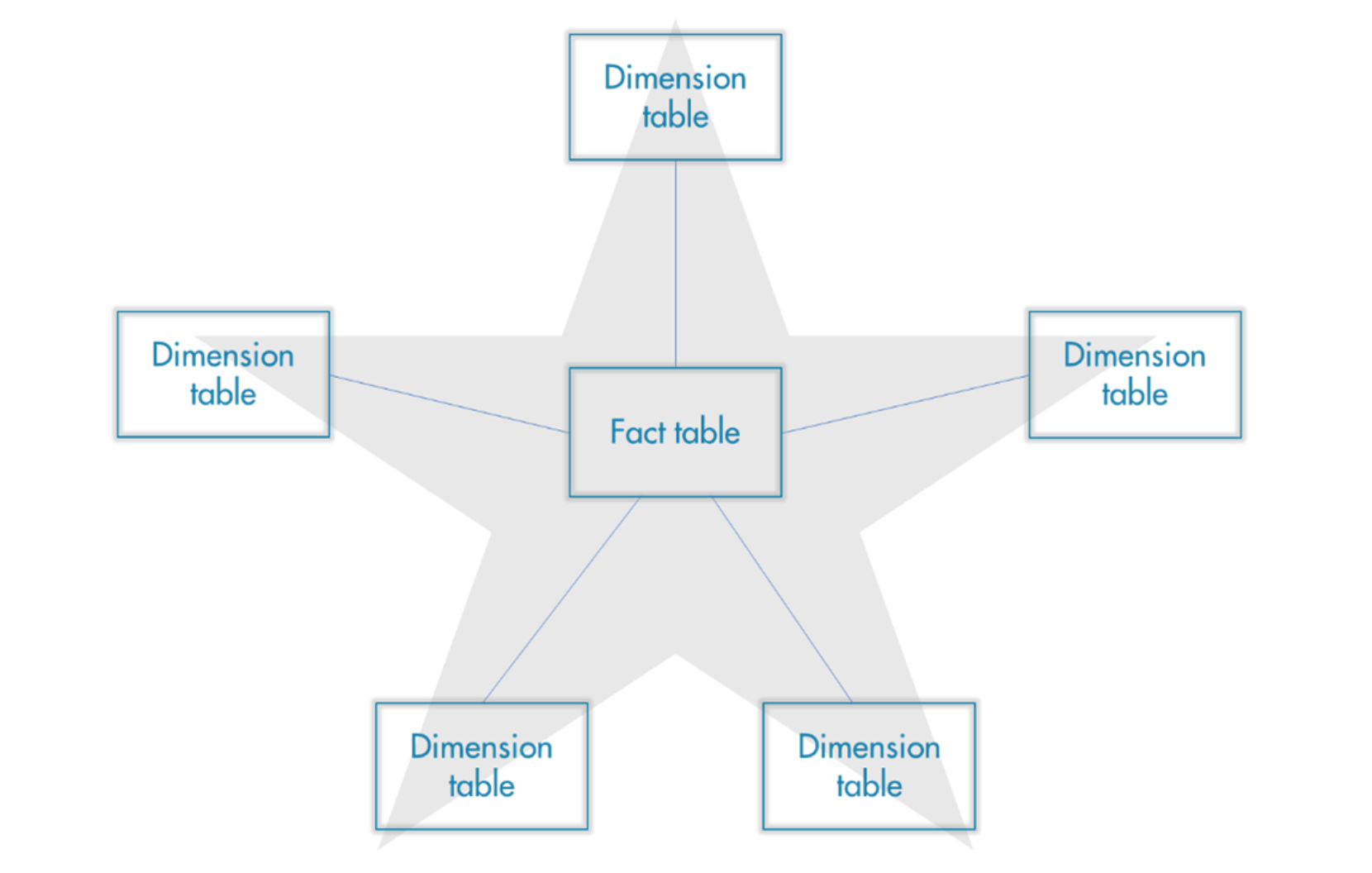
Much the same as Excel, there is a certain amount of learning what functions are offered by DAX through exposure to Power BI. An important prerequisite to this, is to ensure the underlying data model is organised efficiently. I found that the ‘Star Schema’ (see figure 1) greatly improves the performance of a dashboard when querying large data sets and I’d highly recommend its use to any new user of the platform.
Figure 1: A representation of the Star Schema data model
An early challenge we encountered with DAX was that the time intelligence functions it offers are geared towards looking at months, quarters and years rather than hours, minutes and seconds. This was a frustration when we came to compare time periods in the same graph and initially resulted in some less-than-elegant hacks to properly visualise what we wanted to see. Of course, there was a method to side-step this problem which proved to be the DAX function CALCULATE, which operates in much the same way as a SUMIF formula in Excel. CALCULATE is a function that allows a user of Power BI to override filter context and to utilise customised time filters, proving to be the correct solution.
Another issue that quickly became apparent was that using DAX to create calculated columns for large datasets caused some performance issues for the resulting dashboard. An example we have run up against was the creation of a netflow profile for a given DMA. Using 15-minute flow data from inlets and outlets, we created a calculated column to net off the outflows so as to measure assumed consumption within a DMA. Obviously, when looking at 15-minute data, a large number of calculations were necessary to create a netflow profile over a period of time suitable for analysis, which drastically increased the size of the .pbix file. We found that the added strain on computer resources slowed down the performance of the dashboard and negatively affected the value of Power BI to us as a tool. There proved to be two solutions to this problem. The simpler of the two was to create a ‘measure’, which can be done without using DAX code thanks to a pre-set list of ‘quick measures’ offered by Microsoft. These are off-the-shelf calculations that can be applied to pre-existing columns on demand, thereby not adding to the size of the file. The second option involved the use of SQL. When importing data from our relational database it proved to be possible to write an SQL statement that pivoted the data into a format more useful for our analysis, improving efficiency.
In conclusion, though not geared to time intelligence functions so much as date intelligence, Power BI is a versatile tool that is more than capable of dealing with large data sets. When dealing with such data sets, limiting the amount of processing necessary in Power BI to pivoting data and producing visualisations will result in a much smoother and more user-friendly solution. While in an ideal world you would bring in your data in the state you wish to analyse it, multiple solutions exist within Power BI if this is not possible.